Context
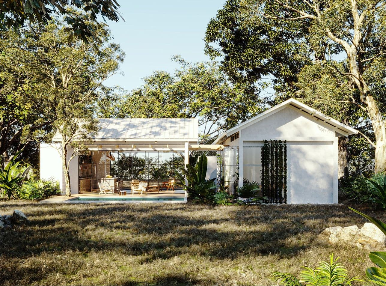
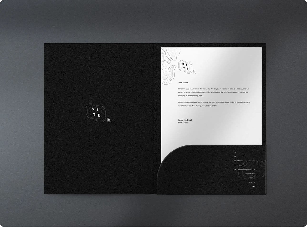
An architecture studio built on a minimalist, modern, ecological approach, with an identity that needed to be as considered and restrained as the spaces it designs. For a studio whose work is about clarity, the brand had to embody it, not just describe it.
Solution / Impact
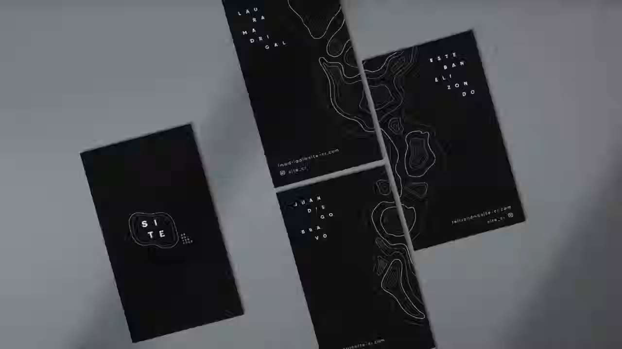
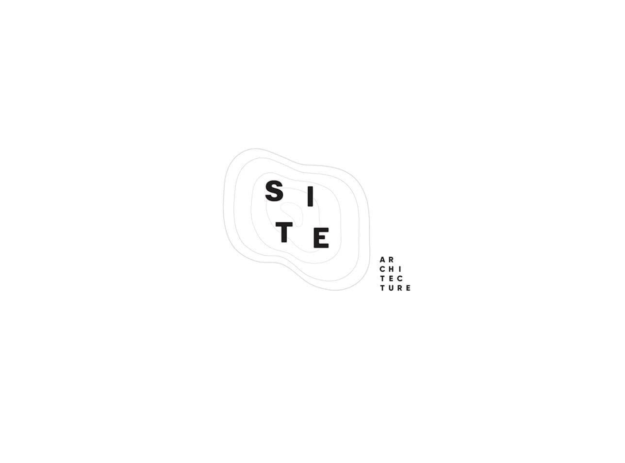
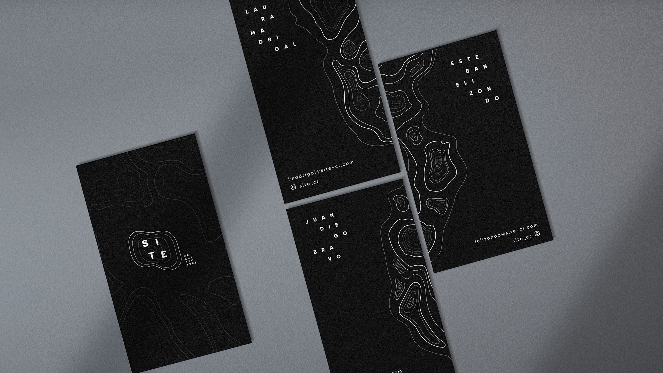
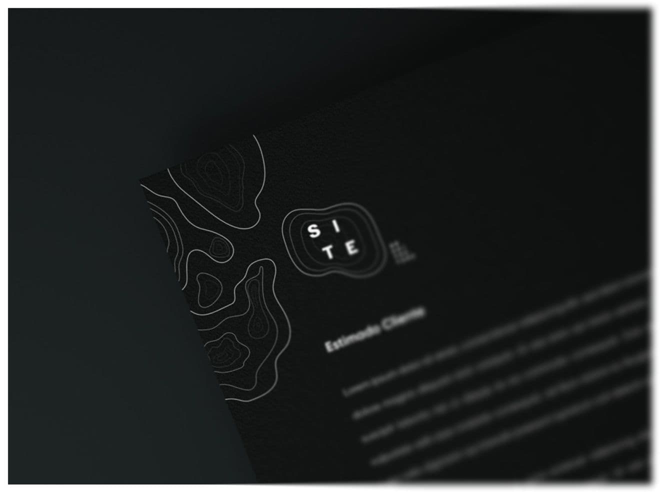
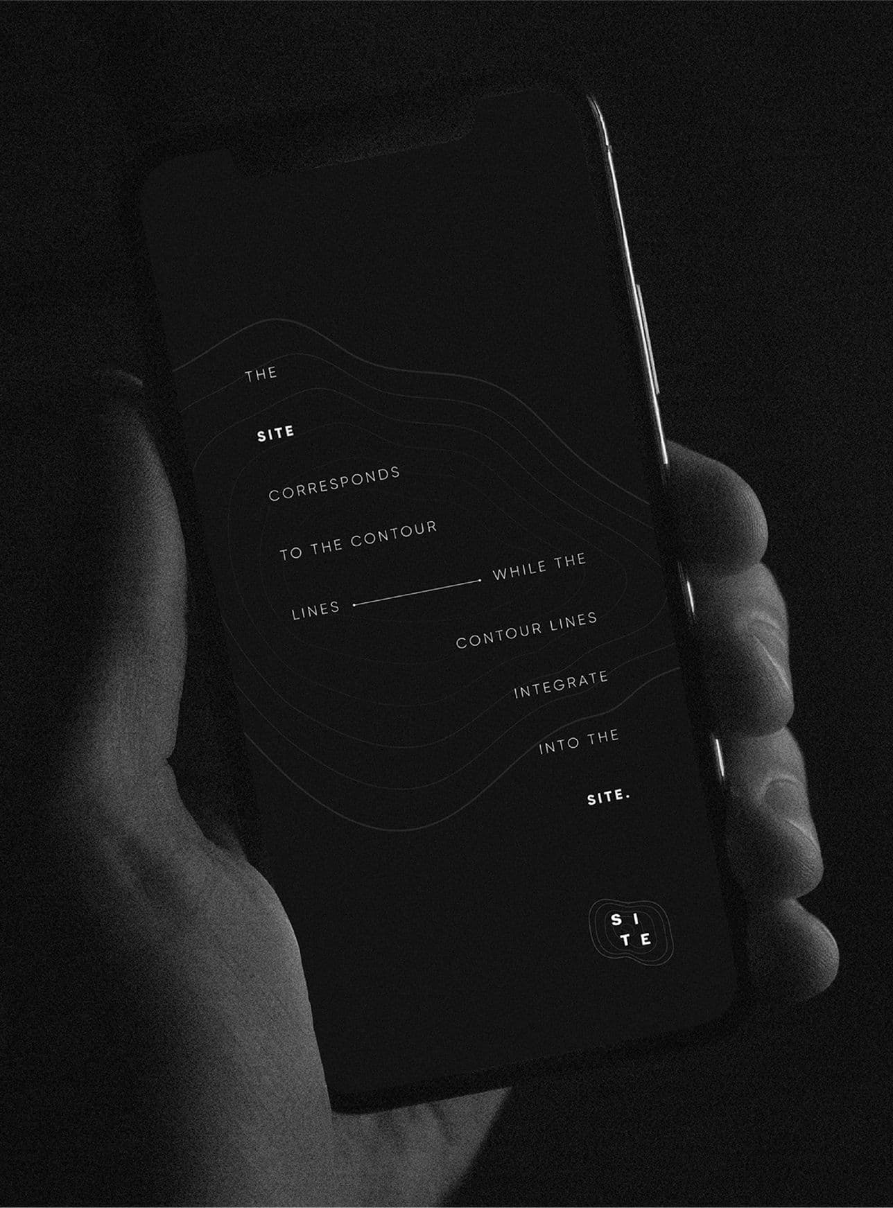
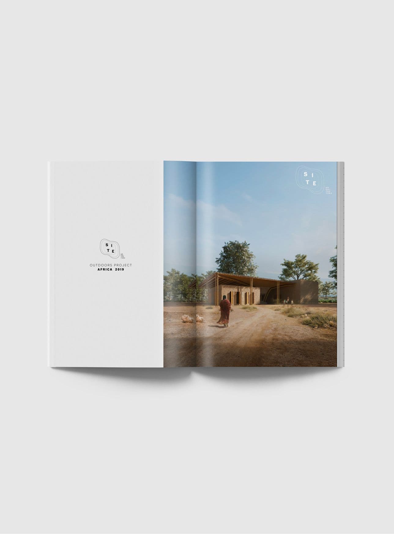
A logotype and visual identity as spare and intentional as the architecture itself, anchored by a strategy that makes the eco-minimalist stance legible. Form following function, the brand designed on the same principles as the work.
Logotype DesignBrand StrategyVisual Identity